Insights · 5 min read
Color & Seasonal Dressing: A Practical Guide
Color is the fastest signal an outfit sends, and one of the easiest to get wrong by accident. A few working principles go further than chasing whatever's trending this season.
Color Is a Tool, Not Just an Aesthetic Choice
Before choosing what's fashionable, it's worth understanding what a color communicates in context. Red reads as confident and assertive — useful in a pitch, potentially overpowering in a first meeting with a conservative client. Navy and camel read as steady and trustworthy. Neutral palettes let other people's attention stay on what you're saying rather than what you're wearing.
None of this means avoiding color — it means choosing it deliberately, the same way you'd choose your words in a meeting.
Working Principles
Building a Base Palette
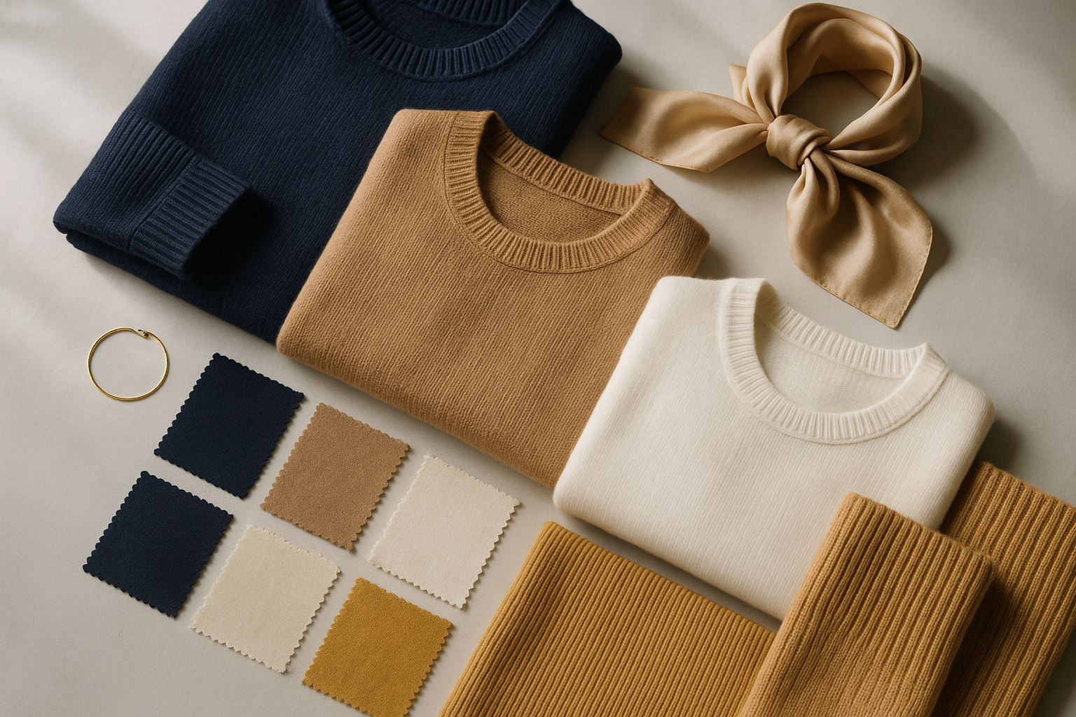
Anchor a wardrobe around 2-3 neutral base colors (navy, camel, grey, black) that mix reliably with each other, then add 1-2 accent colors you genuinely like wearing — this gets more mileage than a wardrobe of one-off trend pieces that don't combine.
When to Wear Red in Business
Effective for moments that call for visible confidence — presentations, pitches, leadership settings — but worth using selectively rather than as an everyday color, precisely because its impact comes from contrast with more muted days.
Metallics and Statement Colors
Gold tones pair most easily with warm neutrals (camel, cream, brown); a little goes further than people expect — one gold accessory or accent piece, not several competing for attention at once.
Layering for Hong Kong's Climate
Between outdoor humidity and heavily air-conditioned offices, a lightweight layer you can add or remove (a fine knit, a structured scarf) does more practical work than a single heavy or single light outfit choice.
Seasonal Notes Worth Keeping in Mind
Camel and wool-blend coats remain a genuinely timeless winter investment — a better long-term choice than a trend color you'll tire of within a year or two.
Velvet works well beyond formal occasions in cooler months — a velvet blazer or accessory can read as elevated business-casual rather than costume-like, if the rest of the outfit stays simple.
Pastels read as approachable rather than unprofessional when paired with structured, tailored pieces — the structure signals professionalism even as the color softens it.
Bold prints (florals, animal print) work best as a single statement piece rather than combined with other statement elements — let one thing do the talking.
Color strategy is one part of building a coherent personal or brand image — the same principles apply whether you're dressing for a client meeting or building a company-wide visual identity. See our guide to brand image management for the organisational angle, or our Personal Image Power-Up Program for individual wardrobe strategy.
Ready to make a lasting impression?
Let's design a program around your goals — for yourself, your team or your organisation.
Start the conversation